The graphic side of Making Use was developed by Krzysztof Pyda, a designer living in Berlin. His cooperation with the curatorial team began at the early stages of work on the exhibition. In the spirit of usology, Pyda relied on the coefficient of art more than traditional canons of proper graphics, such as clarity, discipline, and legibility. The task of the graphic design was rather to convey the amorphous, evolving character of the exhibition, aimed at distributing information about “art beyond art.” Another essential task for the graphic artist was to illustrate postartistic practices that are not materialized through works of art. Many of them took the form of posters, flyers, placards, or stickers designed by Pyda.
Each of the graphic elements he prepared references the concepts of usology and museum 3.0. The proposed system comprised three fundamental elements: typeface, tagged reports, and illustrations of glossary entries. The exhibition consistently uses Metafont, designed by Donald Knuth (1977, introduced into use in 1984), used for creating bitmap fonts. This embodies the ideal of democratic design (in this case of the shape of characters), i.e. graphic usology. Thanks to metaflop.com, users can create a font to meet their own needs.
The system of tags and descriptions was created to help the audience navigate the exhibition, immerse them in the specific terminology, and demarcate functional zones and thematic trails. The system has two versions: digital and analog. The first alludes to the online cloud of tags organizing the site www.makinguse.artmuseum.pl. The graphic elements merge virtual space and physical space, similarly organizing the content of the exhibition. Information about reports is printed on cards stamped with tags. You can pick up the cards and wander around the exhibition with them.
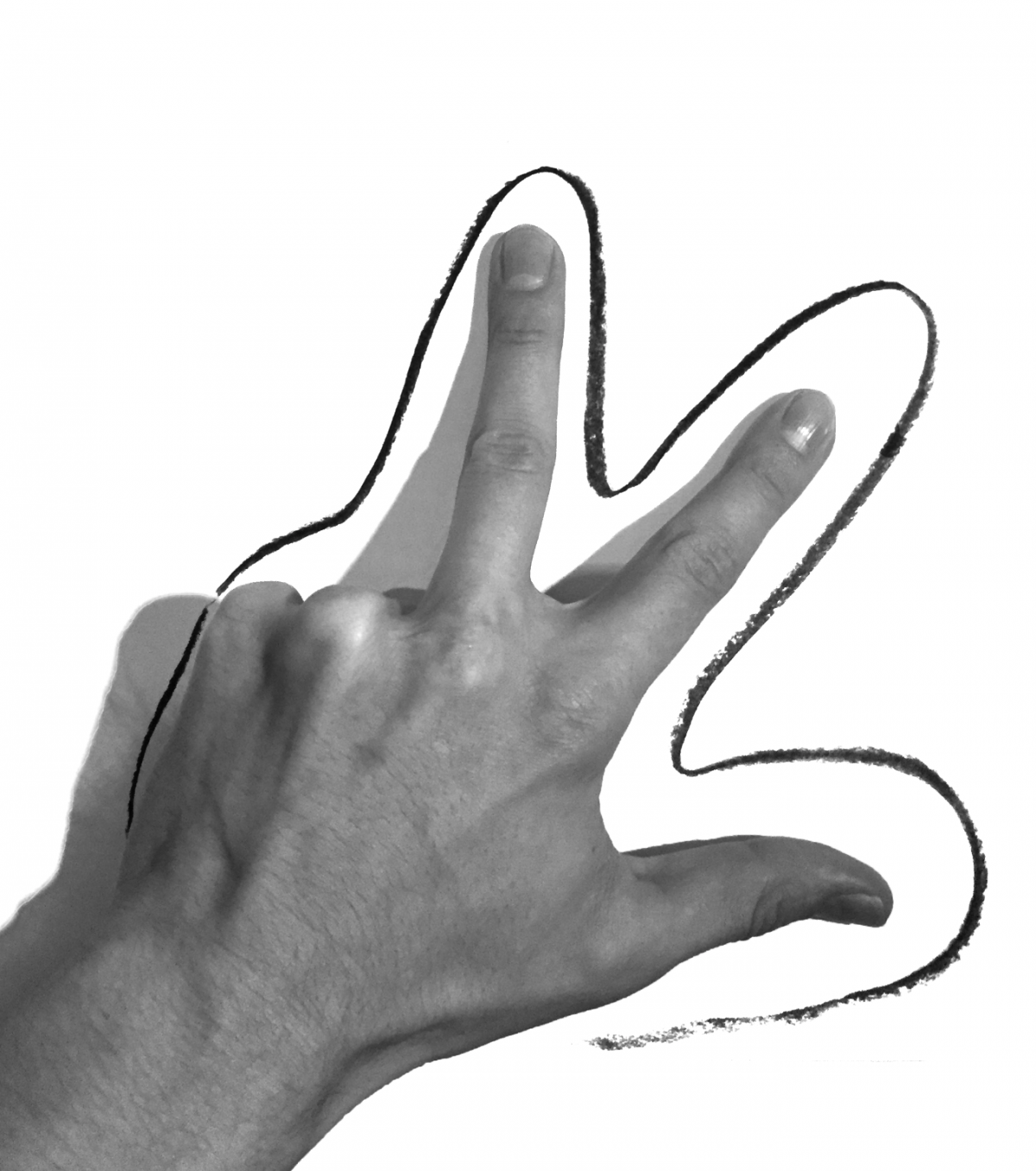
The third part is illustrations of glossary entries, made with the simplest tools – paper, crayons, and visual materials available online. With the help of the human hand as a “symbol of utility” (in contrast from passive “viewing”), Krzysztof Pyda illustrates and illuminates the system of key terms used in the exhibition, while at the same time highlighting their anecdotal character. The hypertext aspect, so important for a website, is underscored through the physical presence of printed glossary entries, reminiscent of pages of a wall calendar that can be torn off, kept, and used.
Pyda also created the drawings used in social media, blogs, and newsletters to communicate the exhibition, illustrating concepts such as museum 3.0 and 1:1 scale.
Inspirations: